Responsive Card Layout Tool
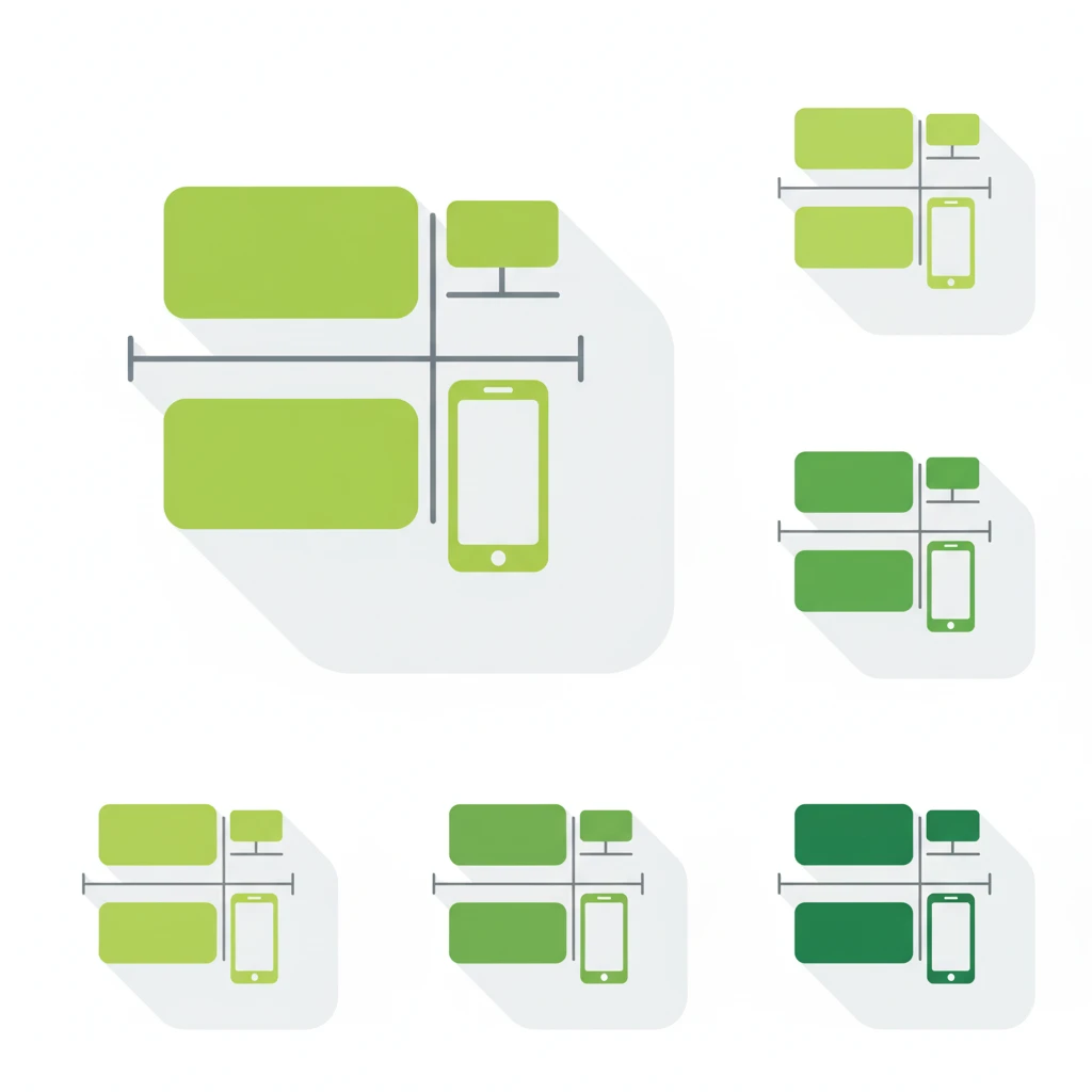
The Responsive Card Layout Tool is a free, browser-based utility that helps you design and preview card-based layouts that adapt seamlessly across devices. You can adjust column count, spacing, and responsive breakpoints, then export clean CSS Grid or Flexbox code for effortless implementation.
How to Use This Tool
-
Using the Responsive Card Layout Generator Tool, you can quickly create professional web card layouts without coding knowledge. This online card builder allows you to set the number of cards, adjust columns, and control spacing for any screen size. The responsive card maker is SEO-friendly, lightweight, and perfect for developers, designers, and marketers who want clean HTML and CSS snippets.
The tool offers multiple customization options like aspect ratio control, card styles, and button designs. You can switch between layouts such as modern, minimal, elegant, or corporate. Every card can include an image, title, description, and CTA button. With live preview, you see changes instantly, making web design faster and more efficient.
Advanced features include color customization for background, text, borders, and shadows. You can adjust card spacing, shadow intensity, and export HTML/CSS code instantly. This ensures your design is optimized for UI/UX, performance, and responsive web development.
Finally, the tool is ideal for building SEO-optimized landing pages, product cards, portfolio grids, and content previews. With one click, you can copy clean, optimized code ready for integration into any website or CMS. It saves time, improves workflow, and helps you deliver modern responsive card layouts that rank higher in Google.
Use Cases
- Design responsive card grids for product listings, blog posts, or portfolios.
- Ensure consistent spacing and layout across mobile, tablet, and desktop views.
- Quickly generate CSS Grid or Flexbox code without manual calculation.
- Prototype layouts rapidly during development or design iterations.
Key Features
Responsive Configuration
Set custom breakpoints for mobile, tablet, and desktop layouts.
Column & Gap Control
Adjust the number of columns and spacing between cards.
Grid or Flexbox Code
Generate layout using either CSS Grid or Flexbox.
Live Layout Preview
See real-time changes before exporting code.
Copy-Ready CSS
Easily copy the generated CSS for use in your project.
Frequently Asked Questions
It helps you design card-based layouts that adapt to different screen sizes by adjusting columns, gaps, and breakpoints. It then exports the CSS in Grid or Flexbox format.
Yes — the tool is entirely free and requires no registration.
You can generate layouts using either CSS Grid or Flexbox.
Yes — the tool provides a live preview to visualize responsiveness before copying the CSS.
User Ratings & Feedback
Share Your Experience
Recent Reviews
No reviews yet
Be the first to share your experience with this tool!
👨💻 About the Developer
Muhammad Abid Rahimi
Professional full-stack developer with expertise in creating high-performance web applications and tools. Specializing in PHP, MySQL, JavaScript, and modern web technologies. Passionate about building user-friendly interfaces and scalable backend systems that deliver exceptional user experiences.