Column Layout Generator
While the page couldn’t load directly, it's highly likely that this tool functions similarly to the CSS Grid Builder on FreeToolsMax—a visual utility for defining multi-column layouts. You can configure columns, rows, gaps, and layout areas using an intuitive interface, with real-time previews and exportable CSS/HTML code.
Column Layout Generator
Column Layout Generator
Create responsive column layouts with CSS Grid and Flexbox. Generate code, preview designs, and customize every aspect of your layout.
🎛️ Layout Controls
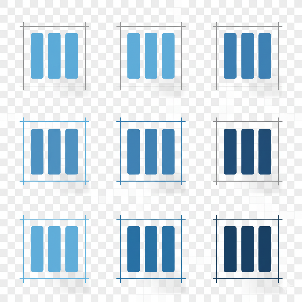
👁️ Layout Preview
💻 Generated Code
🌟 Layout Features
📱 Fully Responsive
Automatically generates responsive layouts that work on all devices from mobile to desktop.
🎨 Multiple Frameworks
Supports CSS Grid, Flexbox, Bootstrap, Tailwind CSS, and custom CSS implementations.
⚡ Performance Optimized
Generates clean, efficient code with best practices for optimal performance.
🔧 Easy Customization
Fine-tune every aspect of your layout with intuitive controls and real-time preview.
How to Use This Tool
-
The Column Layout Generator tool is a simple way to create professional CSS layouts without coding from scratch. To use this tool, first enter the number of columns you want, set the gap size between elements, and define the column width in pixels. You can also adjust the minimum height for each block to ensure responsive design consistency. By adding your desired color code, you can quickly style your grid or flexbox layout with custom themes. This makes it ideal for designers, developers, and beginners learning CSS grid system and flexbox layout design.
Once you fill in the form, the generator instantly provides you with HTML structure and CSS code. You can choose between CSS Grid layout or Flexbox layout system depending on your project. The preview section shows how the columns look in real time, making it easier to adjust spacing, width, and colors. This feature saves time when building responsive website layouts, landing pages, or portfolio designs.
Another powerful feature is the responsive option, which automatically adapts the column design for smaller screens. By checking the "Make Responsive" option, the tool ensures your grid or flexbox columns stack vertically on mobile devices. This is crucial for mobile-first design, UI/UX optimization, and SEO-friendly web development. You can also copy the generated CSS styles with one click and paste them directly into your project.
This tool is perfect for creating multi-column layouts, content grids, and flexible website structures. Whether you’re working on e-commerce stores, blogs, or business websites, the Column Layout Generator provides a fast and reliable solution for modern web design. It eliminates repetitive coding and gives developers clean, optimized, and responsive CSS column layouts for any project.
Use Cases
- Design responsive multi-column layouts efficiently.
- Visually prototype page structure before coding.
- Generate clean, production-ready HTML and CSS.
- Customize grid alignments and multi-row/column areas visually.
Key Features
Define Columns & Rows
Set any number of columns or rows using flexible units (fr, px, %, auto).
Control Gaps
Set row-gap and column-gap for spacing.
Alignment Controls
Adjust content alignment using justify-items, align-content, etc.
Template Areas
Designate grid areas using template names for structured layouts.
Live Preview
Instantly visualize grid changes as you customize settings.
Export HTML/CSS
Generate clean, copy-paste-ready HTML and CSS code.
Frequently Asked Questions
Yes — it’s completely free and requires no login.
You can define columns, rows, gaps, alignment, and grid areas visually.
Yes — it updates the grid layout in real time as you adjust settings.
It generates clean HTML and CSS code that you can copy directly to your project.
Yes — this tool appears to be the same or very similar to the CSS Grid Builder tool listed on FreeToolsMax.
User Ratings & Feedback
Share Your Experience
Recent Reviews
No reviews yet
Be the first to share your experience with this tool!
👨💻 About the Developer
Muhammad Abid Rahimi
Professional full-stack developer with expertise in creating high-performance web applications and tools. Specializing in PHP, MySQL, JavaScript, and modern web technologies. Passionate about building user-friendly interfaces and scalable backend systems that deliver exceptional user experiences.