Box Shadow on Hover Demo
The Box Shadow on Hover Demo allows you to visually explore how CSS box-shadow behaves when an element is hovered. Customize properties like offset, blur, spread, color, and transition duration to see live interactive effects and generate the corresponding CSS code.
CSS Box Shadow on Hover Generator
Box Shadow on Hover Generator
Create beautiful hover effects with custom box-shadows. Visualize in real-time and copy ready-to-use CSS code.
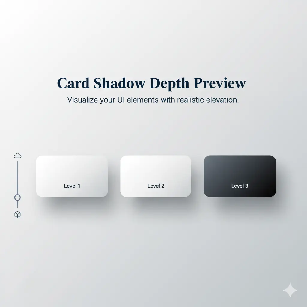
Card Hover
Elevated card effect on hover
Button Glow
Glowing button effect
Image Frame
Photo gallery style
Product Card
E-commerce product hover
🎯 Shadow Properties
🎨 Colors & Opacity
✨ Effect Type
⚡ Quick Presets
💻 Generated CSS Code
Material Design Elevation
Google's Material Design elevation effect with smooth shadow transitions.
Neon Glow Effect
Vibrant neon glow with multiple shadow layers for intense visual impact.
Floating Card Effect
Creates the illusion of elements floating above the surface with large blur.
Pulse Animation
Continuous pulse animation that draws attention to important elements.
📚 Box Shadow CSS Guide
🎯 CSS Syntax
The box-shadow property syntax:
Parameters:
• Horizontal: Left/right offset
• Vertical: Up/down offset
• Blur: Shadow softness
• Spread: Shadow size
• Color: Shadow color
• Inset: Inner shadow
💡 Best Practices
- Use rgba() for opacity control
- Combine with transform for 3D effect
- Consider performance with will-change
- Test on different backgrounds
- Use multiple shadows sparingly
- Ensure accessibility contrast
Pro tip: Use cubic-bezier() for natural feeling animations.
⚡ Performance Tips
Box shadows can impact performance if overused:
- Limit blur radius on many elements
- Avoid animating box-shadow directly
- Use opacity instead of color changes
- Consider using filter: drop-shadow()
- Test on mobile devices
How to Use This Tool
-
The Box Shadow on Hover Demo tool allows designers, developers, and UI/UX enthusiasts to easily create and preview CSS box-shadow effects with full customization. Start by adjusting the shadow properties such as X offset, Y offset, blur radius, spread radius, shadow color, and opacity. These settings control the depth, direction, and softness of the shadow, making it easy to design effects like subtle lifts, floating cards, glowing buttons, or layered shadows. By using the color picker and opacity slider, you can create shadows with solid colors, transparency, or neon glow effects that match your design needs.
Next, customize the box properties such as width, height, background color, and border-radius. This allows you to test shadows on different box sizes, shapes, and colors for a realistic preview. You can also fine-tune animation settings by adjusting transition duration, easing function, and hover effects like shadow only, lift, scale, glow, or multiple shadows. These options are essential for creating interactive UI elements, modern buttons, stylish cards, and professional hover animations that improve user experience.
Once satisfied, check the live preview panel to see your design in action. You can also view and copy the generated CSS code, or switch between HTML, CSS, and React tabs for implementation in different projects. Designers can experiment with pre-made shadow examples such as subtle elevation, floating cards, neon glow, and multiple shadow layers. This tool saves time, enhances creativity, and ensures responsive design, cross-browser compatibility, clean CSS code, and modern UI styling for websites, apps, and front-end projects.
Use Cases
- Learn how CSS box-shadow looks and behaves on hover in real-time.
- Design hover elevation effects for buttons, cards, and UI elements.
- Generate CSS code snippets for hover shadows—ready to copy.
- Experiment with shadow intensity and animation duration visually.
Key Features
Interactive Hover Preview
See how the box-shadow animates on hover in real time.
Preset Examples
Click presets like Basic, Material, or Deep Shadow to apply styles instantly.
Custom Shadow Controls
Adjust offset, blur, spread, color, and opacity manually.
Transition Timing Control
Set how quickly the shadow appears using transition duration.
One-Click CSS Export
Copy the generated CSS code snippet for easy integration into your site.
Frequently Asked Questions
Yes, it’s completely free and requires no login or registration.
Yes, the tool allows you to see hover shadows in real time on a sample box.
You can adjust horizontal & vertical offset, blur radius, spread radius, shadow color, opacity, and transition duration.
Absolutely—there's a one-click option to copy the generated CSS for your project.
Yes—you can click on predefined shadow examples like Basic, Material, or Deep Shadow to try them instantly.
User Ratings & Feedback
Share Your Experience
Recent Reviews
No reviews yet
Be the first to share your experience with this tool!
👨💻 About the Developer
Muhammad Abid Rahimi
Professional full-stack developer with expertise in creating high-performance web applications and tools. Specializing in PHP, MySQL, JavaScript, and modern web technologies. Passionate about building user-friendly interfaces and scalable backend systems that deliver exceptional user experiences.